
Showing posts with label Brief 5 - Cymatics. Show all posts
Showing posts with label Brief 5 - Cymatics. Show all posts

11.12.12
Audio Visual Book
Photo~shoot for the audio visual book...
Decided against binding it for hand in, we liked the idea of being able to re-order the events to create the users own story, but also due to time restraints we will wait until after hand in to bind the book for the quality we desired.
Decided against binding it for hand in, we liked the idea of being able to re-order the events to create the users own story, but also due to time restraints we will wait until after hand in to bind the book for the quality we desired.
10.12.12
Book Print Out
Given my role in the brief I felt doing a few print outs, would give me a better idea of how the final book would feel and operate. It also allowed me to test any missing links or pre final production issues. The book works well to an extent but it needs more visual clarity running through out.
I mapped out any changes that needed to be made on the mocked up book and revisited it on the computer to add any final text and changes.
I mapped out any changes that needed to be made on the mocked up book and revisited it on the computer to add any final text and changes.
9.12.12
Poster Designs
Showing the connections between each poster and how it produces the ability to move them along, making the wave formation go up and down.


8.12.12
Grid & Layout
I have been experimenting with different grids and points sizes with the grids for the cymatics book to get an idea of the best way of using each bit of information and applying a hierarchy.
Initially we planned on using tipped in pages, but decided to run with another idea which I will explain in another post. These are a few of examples that I experimented with the layout for the introduction & key pages.
 This I felt is the most appropriate layout for the document, given the lack of writing through the publication and only a hierarchy of header > body text > page numbers (unless flicking through in which case they will be in the corner and easier to read).
The two column layout provides me with enough space to fit in any paragraphs of text and isn't too restricting for images.
Initially we planned on using tipped in pages, but decided to run with another idea which I will explain in another post. These are a few of examples that I experimented with the layout for the introduction & key pages.

The two column layout provides me with enough space to fit in any paragraphs of text and isn't too restricting for images.
Poster Print outs
These are the final poster designs for print, and the print outs on the chosen coated off white stock. Really happy with how the turned out and the ways each poster integrates because of the systematic layout and folding. The correlation between the back and front also creates a nice contrast between the vibrant colours and black and white imagery on the back.
-
The brief has made massive progress this week and is something we hope to extend over into FMP. Just need to finalise the book designs and we will be ready to photograph the products and put them onto boards.
-
The brief has made massive progress this week and is something we hope to extend over into FMP. Just need to finalise the book designs and we will be ready to photograph the products and put them onto boards.
6.12.12
Testing Binds / Book Progress

-
We are planning on using grey board as a reference to last years project but a lighter and much easier version. We also intend on using this green binding tape I picked up on a trip to London, it eases the binding process making it much easier to hide any imperfections on the spine from the stock splitting etc.

Splatter Scans
I spent a bit of time today scanning and experimenting with the visuals created from analogue test 2. As the dpi was set so high its possible to get some really interesting close ups and the vibrancy of the green really comes to life. These will work perfectly for the publication and possibly even the poster designs but may need to scan it again to an even higher dpi to assure no loss of quality. These files have been reduced to avoid slowing my blog down too much (hence the poor quality).
Poster Designs
Dom and I have spent a few nights simply discussing ideas making it much easier to progress with work the following day. We have also learnt a lot about how and why we work well together and what areas we can each cover.
-
These are my editions of the poster designs that we both created a few off while developing the visuals. We have now swapped documents meaning we can each focus on our indivudual strengths within the brief. Dom have been covering the artwork as his ability to produce variations and interesting designs is much stronger than mine, however my focus and interest in type means we can both stay active on the brief at the same time. We have also been considering how the project could be furthered into FMP, as we feel we work well together and are thinking about what routes to take after finishing the course.
-
The final document consists of a few experiments for the cover of the publication, I do however feel a more minimal final result will be more appropriate.
-
These are my editions of the poster designs that we both created a few off while developing the visuals. We have now swapped documents meaning we can each focus on our indivudual strengths within the brief. Dom have been covering the artwork as his ability to produce variations and interesting designs is much stronger than mine, however my focus and interest in type means we can both stay active on the brief at the same time. We have also been considering how the project could be furthered into FMP, as we feel we work well together and are thinking about what routes to take after finishing the course.
-
The final document consists of a few experiments for the cover of the publication, I do however feel a more minimal final result will be more appropriate.
Posters Print Outs
Tested out how all of the posters aligned so they move along making a wave formation, this was slightly by accident from testing the layouts of the posters, they also align along points in the top. We decided to keep the back black and white and have large colour visuals from each test on the front. Dom selected a series of colours to work with and
5.12.12
Poster Designs
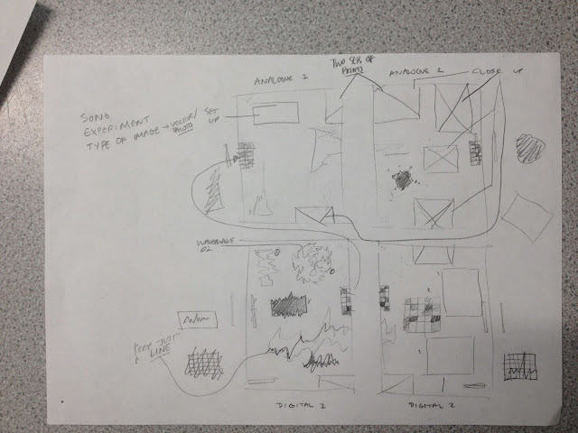
We wanted the posters to fit together linking them back to how sound and audio integrate, I worked on the back while Dom worked on visuals for the front, again picking up on our strengths. I mapped out a rough plan of what I wanted to do with each image before stating on the computer to keep myself organised and match each poster up correctly.
-
Although it seems like a bit of a hectic mess it did prove extremely effective when working on the digital files. The images on the side match up with others in random points, however I felt to keep it more consistent to the idea of the relationship between audio and visual I kept it more consistent in later designs. The final aim for the posters it to be able to move each one along so that it can be played as if its the visuals form a song going up and down.
-
Although it seems like a bit of a hectic mess it did prove extremely effective when working on the digital files. The images on the side match up with others in random points, however I felt to keep it more consistent to the idea of the relationship between audio and visual I kept it more consistent in later designs. The final aim for the posters it to be able to move each one along so that it can be played as if its the visuals form a song going up and down.

3.12.12
Tech Specs


-
The main thing I need to work on now is my use of baselines, Joe Gilmore sent Oli a link that I will have a read over and blog so I have something to reference back to.
-
and considering my type a bit more. Although I consider my choice of typeface I don't understand grids quite.
1.12.12
Colour schemes
Worked on a few colour schemes stemming from both mine and Dom's digital development as well as the images that we took during the tests. This method of creating colour schemes seems like a good way to work making sure everything stays relevant. I will keep reworking these colour schemes and do a few print outs to see how the colour comes out.
29.11.12
Analogue Test 1 & 2
These are some of the first digital files working with the scans of the paint from analogue test two. I have just been experimenting with colour, scale, overlapping each and adding keys. There I have also started to think about how I could overlap each of the tests to make single images. I will move the designs into inDesign and start adding the type to scale for the posters and resize the images for the book/booklet.
Visual/Sound/Sound/Visual
I started working on a logo while Dom developed the video aspects of the project, we stuck with the circle logo for a visual, based on the speaker from last years project. We felt it was core to the progression from the previous 'Cymatics' brief. Also it fits well in context with the type / layout work. The idea was to create something that could be read from all angles and given the name of the project, it can be read in either direction and it doesn't change the definition. It also represents a sort of symmetry between sound and audio. The lines in the logo are reflective of those Dom was using to create the sound-waves.
-
The idea for the logo stemmed from initial type tests on the third page of this document, where I was extending the points to make it look like a sound-wave. We wanted something simple and bold, which I feel I have answered. The division of labour has been particularly successful in this brief, and we have achieved a lot in a few days, just need to make sure we maintain this progress and finish the brief giving ourselves time to finish our other projects.
Visualising Sound 2
The next part of our experiments was methods of recording out findings without the aid of cameras and videos. We had pre-decided a few methods, one of which was holding paper above the speaker with a consistent amount of paint, consistent volume and the paper kept in the same place. The songs were played all the way through allowing us to see patterns, we will digitalise these files and start to overlay them fitting them in with the digital designs we were working on.
-
We changed around roles slightly, but for the majority of the time I was taking the photos and Dom was filming as we felt we were better suited to these roles.
 Test 3 - Analogue 1
-
Using the same consistency of green paint we held sheets of paper behind the speaker fixed in place, and played each of the four songs through seeing how the sheets were delivered about. Really successful experiment and we started to see patterns emerging from the songs and managed to get some really interesting photographs. Unfortunately the lighting wasn't as good as it could have been so we had to use flash, this resulted in sharp photos but the depth was slightly ruined, as it flattened the light variations in the images.
-
The image to the left shows roughly what each of the prints looked like, changing depending on the tempo and volume of certain points in the song.
 Test 4 - Analogue 2
-
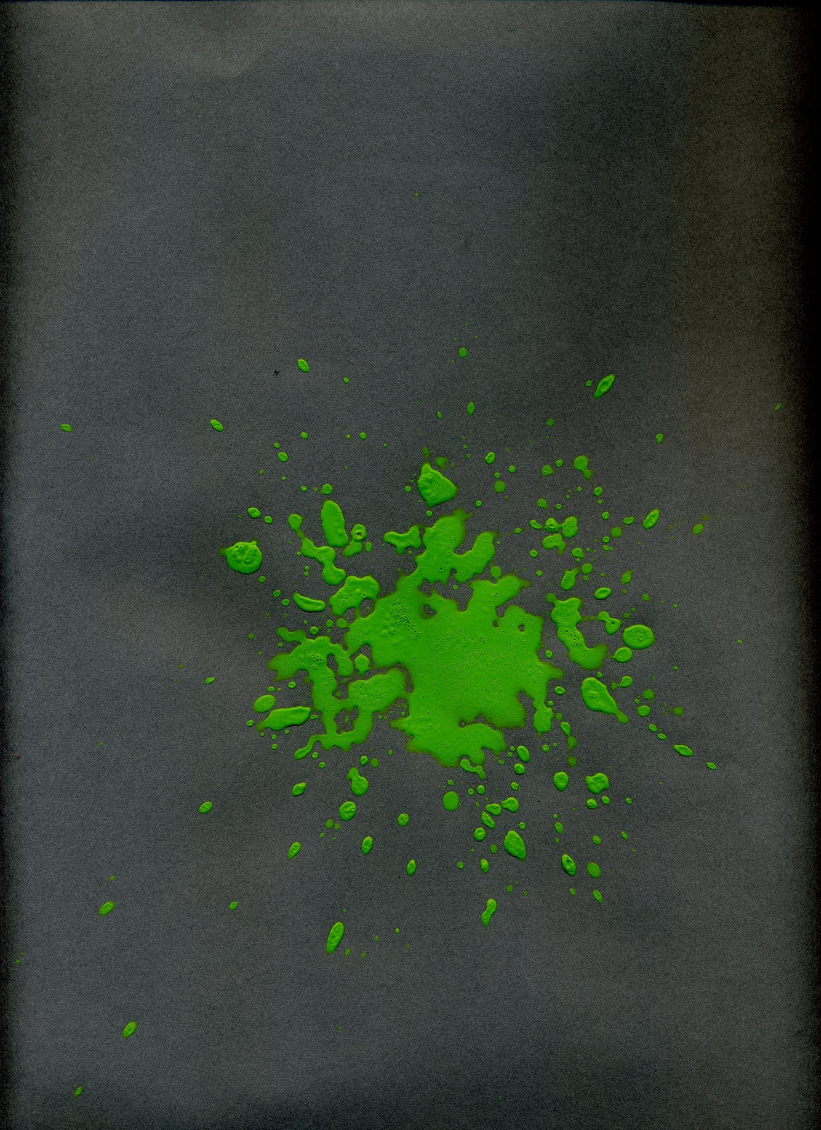
This was essentially the same test but keeping the bits of paper at the same height above the paper, again using the same amount of paint for each test and the same volume. It was the ability to define these variables through the previous tests that made them successful. Some beautiful results and really interesting images, also because of slightly better lighting the flash wasn't needed. The photos aren't as sharp as I would have liked them but for the sizes they will be printed they are more than satisfactory.
-
This image to the left shows one of the songs with a particularly intense baseline. Also there were a certain level of consistency between the overhead splatters and those to the side which is what we were hoping for.
-
We changed around roles slightly, but for the majority of the time I was taking the photos and Dom was filming as we felt we were better suited to these roles.

-
Using the same consistency of green paint we held sheets of paper behind the speaker fixed in place, and played each of the four songs through seeing how the sheets were delivered about. Really successful experiment and we started to see patterns emerging from the songs and managed to get some really interesting photographs. Unfortunately the lighting wasn't as good as it could have been so we had to use flash, this resulted in sharp photos but the depth was slightly ruined, as it flattened the light variations in the images.
-
The image to the left shows roughly what each of the prints looked like, changing depending on the tempo and volume of certain points in the song.
-
This was essentially the same test but keeping the bits of paper at the same height above the paper, again using the same amount of paint for each test and the same volume. It was the ability to define these variables through the previous tests that made them successful. Some beautiful results and really interesting images, also because of slightly better lighting the flash wasn't needed. The photos aren't as sharp as I would have liked them but for the sizes they will be printed they are more than satisfactory.
-
This image to the left shows one of the songs with a particularly intense baseline. Also there were a certain level of consistency between the overhead splatters and those to the side which is what we were hoping for.
Visualising Sound - 1
After realising that we needed to make some serious progress with our Cymatics brief we decided to dedicate two days towards the experiments and start gathering visuals. I started on the MP3 conversion files the day before the experiments. We tried a variety of experiments and completely destroyed the speaker but got some amazing visuals to work with.
Test 1 - Grey Board Attempt 1
Using a piece of grey board on the top of the speaker and various viscosities of paint we experimented with a variety of songs to see what visuals we could achieve as well as practical research. Wasn't as successful as it could have been, mainly due to the songs cutting out and the wrong paint / water mixture the paint became dorment and lifeless.
-
It was the unsuccessful parts of this experiment that have led the others to be far more successful, a very important part of the process. It also opened our eyes to the possibilities of these processes and what methods we could take to record each one.
Test 2 - Grey Board Attempt 2
Much more successful but less organised, these tests were aimed more towards finding out how to get the best results in relation to the size of the board / amount of paint. We discovered that when some of the paints reacted with the inks they formed a solid skin and stopped moving.
-
We also started working with consistent amounts of paint using a cap-full for each side of the speaker or colour of paint. Another approach was putting pressure on the speaker meaning the paint flew up higher but gave us less successful video results.
28.11.12
MP3 Experiments

-
I also explored converting different types of files, even .ttf files from typefaces and ended up with similar results. I will spend the next few days playing around with these experiments and finalizing the visuals for the designs.
-
The second document shows the more abstract processes.

-
It looks as if it condenses and the pixels initially at the bottom get sent further to the top until it reaches a variety of greys white and black pixels.
-
When exploring colour the varieties even within one song are endless but given that we are working in black and white plus stocks the grey tones would work well with different coloured stocks.
Subscribe to:
Posts (Atom)