Showing posts with label Packaging. Show all posts

7.2.12

CD Cover

Simple idea for distorting the text and relating it to the content of my title sequence / idents. Also sticking with the same colour scheme to give the overall CD a branded and consistent feel. Using R - 200, G - 200 B - 200. Not exactly sure if it works because the rotated circles make the text hard to read and although it visually communicates the content, the clarity of the communication and legibility is compromised. Thinking about the packagings purpose, a label for the project, I think it needs to be clearer to fit with its purpose, also following the video concept of form follows function and modernist architecture its not the most appropriate outcome.


21.11.11

Net Development

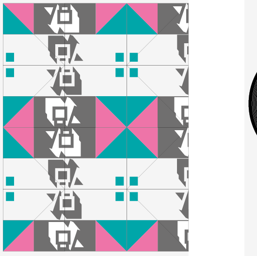
Developing my net designs, one side for the front of the vinyl sleeve and the other is the poster that folds out from the inside. All using the same pantones to maintain consistent branding with the perforated flyer / business card designs. The top design is the final product but will be together to create one sleeve holding 6 vinyls. Experimenting with repeating the 78 logo changing its orientation, to be printed on white card 200gsm because it picks up the desired colours the most effectively and is strong enough to be perforated without tearing. Design will be held together using a belly band.

Typeface used - Futura (different weights)
Pantones - 326M - Turquoise, 232M Pink - These were the best matches to the screen versions
The grey is a CMYK - 70% Key
Stock - White Card 200gsm


19.11.11

Label Experiments

Label designs for the 7inch records, experimenting with different typefaces, kerning, leading and case to get the most legible but visually suitable results. The photos work but compromise the ledgibility so for the moment I will avoid using them. Playing around with a few different colour schemes and gradients, the designs with blocks of colour are much more effective and work with the sleeve designs. Designs done using the same two spot colours as the sleeve to maintain the same identity and images converted to monotone using the selected pantones. Any other colours in the designs are using CMYK swatches. The last 2 designs are the ones I am going to stick with, think the design could look really interesting while it spins, also clearly communicates all of the information on the Vinyl.


17.11.11

Net Experiments

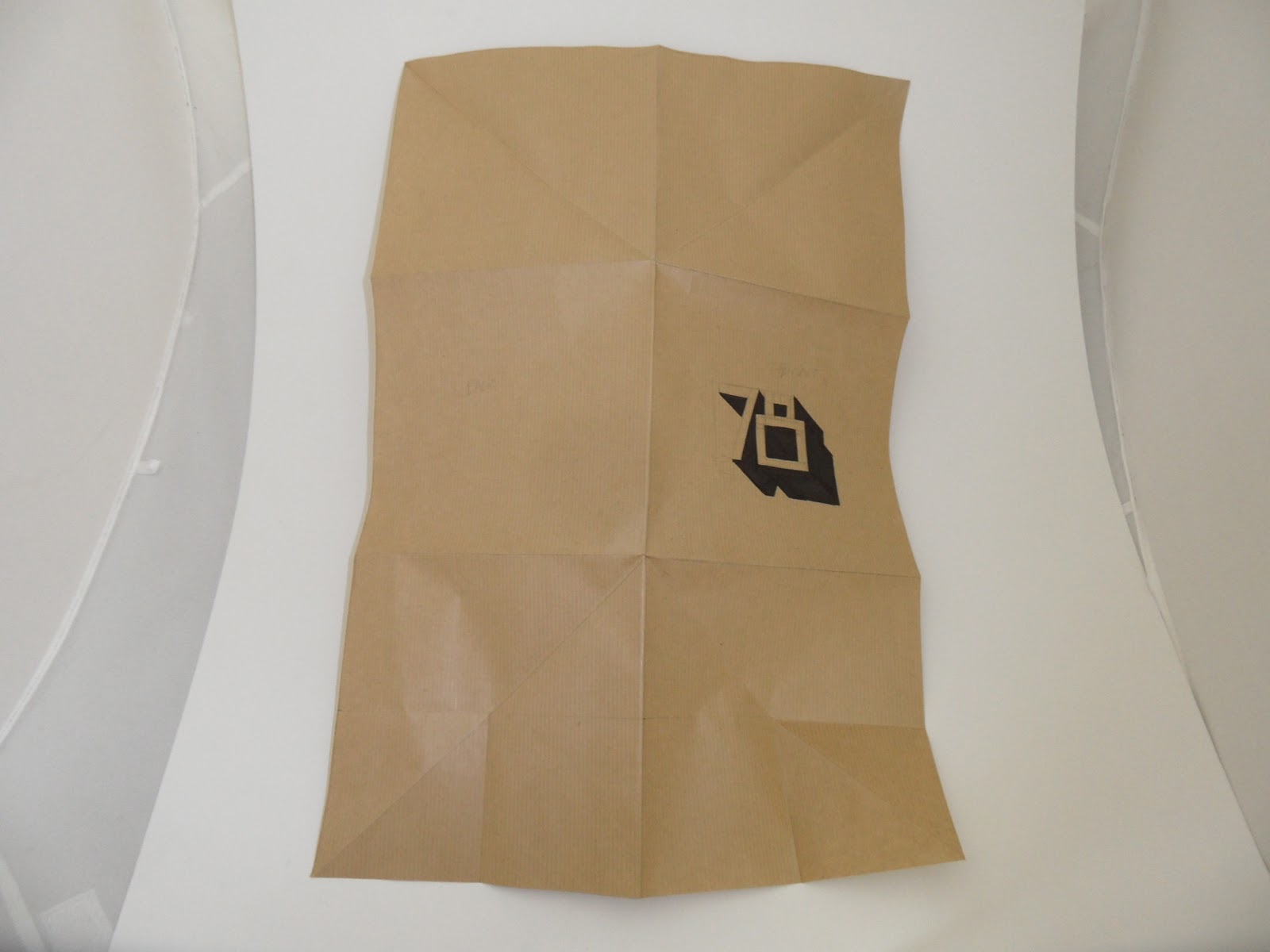
Playing around with my own net designs, proved ineffective in terms of paper waste, needed A0 for just one vinyl. The first design looked nice and there was potential to hold more than one vinyl but this is an area I want to develop. Another consideration is die cutting into the cover design.


15.11.11

Mock ups

I made a few different mock ups playing around with different stocks etc. The last net design is where I have doubled up the net and made a few simple cuts making it possible to hold up to six vinyls, this means I can do my idea of a special release but without having to print out loads of different nets.

Also thinking about how I could incorporate duplexing into my designs using die cutting rather than inks.