
Showing posts with label OUGD201. Show all posts
Showing posts with label OUGD201. Show all posts
22.11.11

78 Final Work
Finished mock up design the print specifications for the actual design are -
- CMYK plus two spot colours
- Pantone 326M / 232M
- Woodfree stock, off white, 230gsm
- Gravure print method
- Die cut and folded
- Middle section perforated allowing buyer to de-tatch the two vinyl sets


- CMYK plus two spot colours
- Pantone 326M / 232M
- Woodfree stock, off white, 230gsm
- Gravure print method
- Die cut and folded
- Middle section perforated allowing buyer to de-tatch the two vinyl sets


21.11.11
Print Manual
Print manual, the format was actually a mistake while saving the files but it works surprising well so I Im going to stick with it.
Net Design sheets
Gone back to some paper based ideas for my sleeve / poster design to gain a greater variety of styles in my designs. Keen on the idea of the lines in the corners but not particularly keen on any of these designs.


78 Embossed
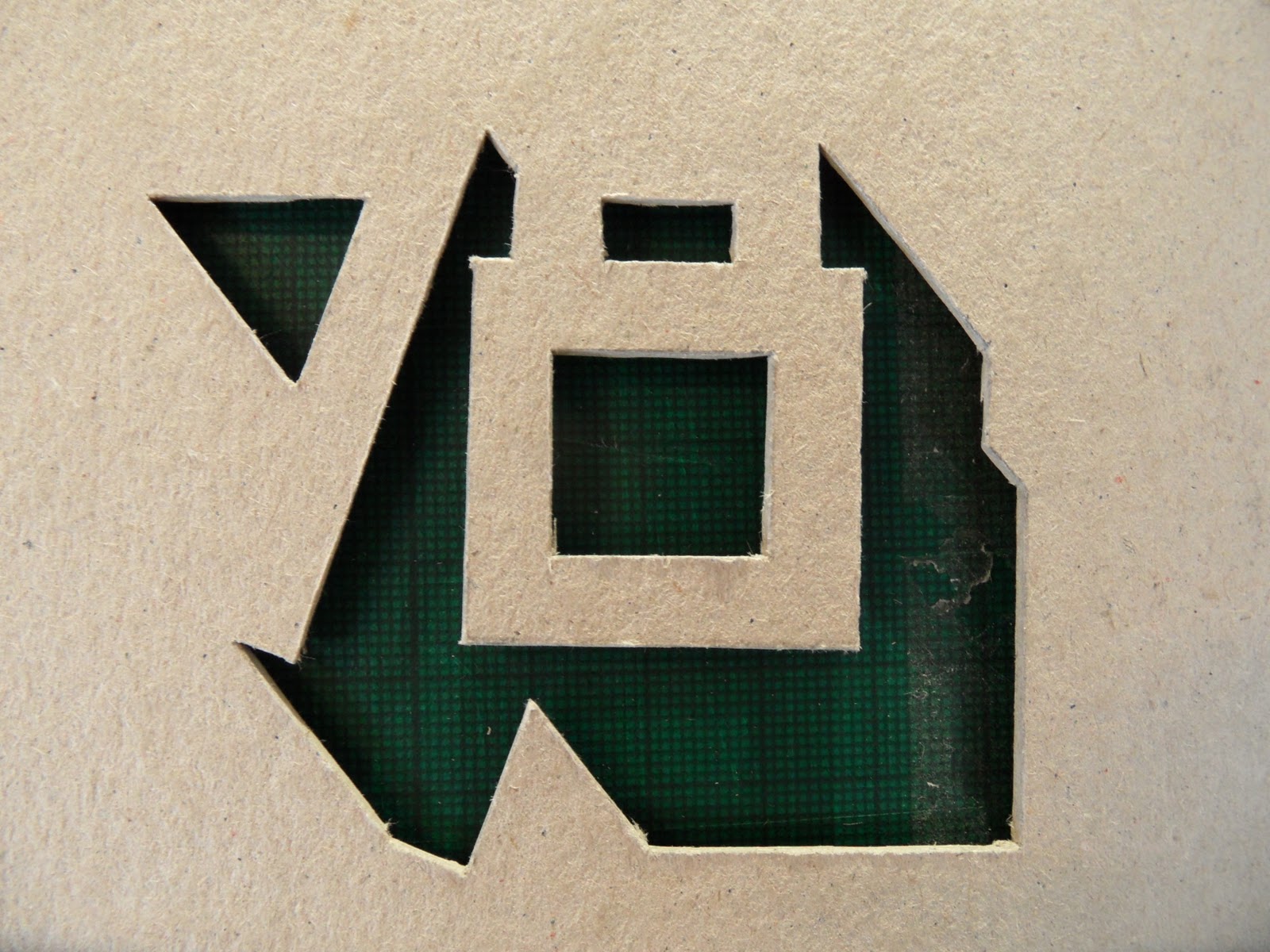
Was thinking about using embossing for the front of my zine, but decided against the zine completly as I didn't think there was enough context or relevance to the rest of the branding / promotion. The embossing was done by cutting out a bit of thick card and running it through the press in print (must wet and roll the paper first to get the best results). Really effective method and hopefully I can use it for another project but I want to stick with die cutting / duplexing at the moment. The embossing was far more effective than the de-bossing and worked particularly well with the watercolour stock.




78 Poster Designs
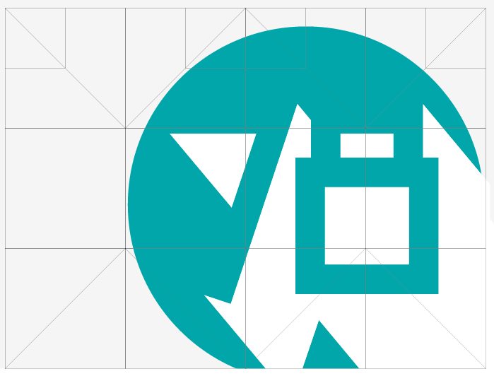
Exploring poster designs, sticking with the current branding, for different scales. The top design has the most appealing aesthetic but to maintain consistency I want to use the bottom design. The destinct lack of information is down to the recognisable colour scheme and idea of people questioning what the posters are about and hopefully looking into them. The posters use the same grid system as the vinyl sleeve design, the last images are a few of the variations I tried before settling on the text layout.


Net Development
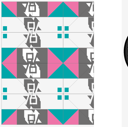
Developing my net designs, one side for the front of the vinyl sleeve and the other is the poster that folds out from the inside. All using the same pantones to maintain consistent branding with the perforated flyer / business card designs. The top design is the final product but will be together to create one sleeve holding 6 vinyls. Experimenting with repeating the 78 logo changing its orientation, to be printed on white card 200gsm because it picks up the desired colours the most effectively and is strong enough to be perforated without tearing. Design will be held together using a belly band.
Typeface used - Futura (different weights)
Pantones - 326M - Turquoise, 232M Pink - These were the best matches to the screen versions
The grey is a CMYK - 70% Key
Stock - White Card 200gsm


Typeface used - Futura (different weights)
Pantones - 326M - Turquoise, 232M Pink - These were the best matches to the screen versions
The grey is a CMYK - 70% Key
Stock - White Card 200gsm


20.11.11
78 Flyer Designs
Flyer Designs, the dashed lines on the first 2 sets of designs represent where the design will be perforated, each section will have a business card feel but not in the standard format you would usually receive one, only a few details including the labels name and email address. The 78 will be die cut on the top and duplexed with another stock meaning no ink is actually used for one side of the design, I want to keep the colours consistent with the rest of the branding, will print off some designs and see how they look cut and duplexed.


Subscribe to:
Posts (Atom)