
I wanted to have one organised post with all the videos from studio brief one and two, I decided having all my idents and title sequence on one post was a bit excessive, so here are the final idents that I produced for my top 10.
Showing posts with label Motion. Show all posts
Showing posts with label Motion. Show all posts
8.2.12

6.2.12
Reworked Ident 1
I wasn't happy with how the last ident 1 worked with the complete series. Decided to take away the rising bridge towers giving me two
idents using the circles / patterns and the others containing only
clean vectors. Kept the audio the same as the fading in and out of the More 4 logo fits perfectly as well as the movement of the circles. Again going for a very minimalist approach with simple movements and reactions to the progressive music, also fitting with the idea of gaining my target audiences interest through mystery and connotations of architecture through the flickering imagery.
Final VIdeos - Title Sequence
Final title sequence video, spent the last 8/9 hours reworking the sequence making sure that all the movements were more in time with the audio choice. Its much easier for me to do a general summary of what has been changed...
- Re-edited the circles at the end to make sure they were all aligned and didn't rotate out of place ruining the composition in the sequence.
- Re-edited the changes in scale for some of the circles giving them a less substantial role in representing the movement in the video.
- There were some minor alterations made according to verbal feedback and discussion with a few class mates. On the rough sequence the rotation was set to fast when the two lines from the simple bridge illustration fall of the page, the new speed fits more with the music and relationship to other elements moving in to the sequence.
- The overall fading in and out of the sound has also had some major reconstruction making sure that the transitons between the final two loops are un-noticable and the track fades out accordingly.
- Typefaces at the beginning were changed to fit with the channel branding to Avenir 85 Heavy
- Re-edited the circles at the end to make sure they were all aligned and didn't rotate out of place ruining the composition in the sequence.
- Re-edited the changes in scale for some of the circles giving them a less substantial role in representing the movement in the video.
- There were some minor alterations made according to verbal feedback and discussion with a few class mates. On the rough sequence the rotation was set to fast when the two lines from the simple bridge illustration fall of the page, the new speed fits more with the music and relationship to other elements moving in to the sequence.
- The overall fading in and out of the sound has also had some major reconstruction making sure that the transitons between the final two loops are un-noticable and the track fades out accordingly.
- Typefaces at the beginning were changed to fit with the channel branding to Avenir 85 Heavy
5.2.12
Re Designed
Wanted to make my bike spin silent movie more consistent with the rest to complete the set. I however really like the concept behind the previous idea but the colour scheme seems a lot more relevant to the context of the situation. Bikes are commonly associated with the red / silver black colour scheme so this background colour seemed far more appropriate, and despite not being able to use silver the black and white contrast still fits and connotes the desired bike aesthetic.
Silent Spin
Again focusing on really minimal and literal representations of the words matching using a vibrant set of 5 different coloured clips. This turned out exactly how I wanted it, the black slightly delayed layer behind brings the video and movements together again fitting with the brief requirements. I used fairly basic techniques for my clips but I feel this was fitting with the minimal desired aesthetic I was going for. In terms of the content is delivers the communicated word and fits with the rest so happy to leave this how it is. Happy I had a bit of time to revisit and re-design these, this is something I hope to keep doing throughout the last module, to really make the most of the briefs.
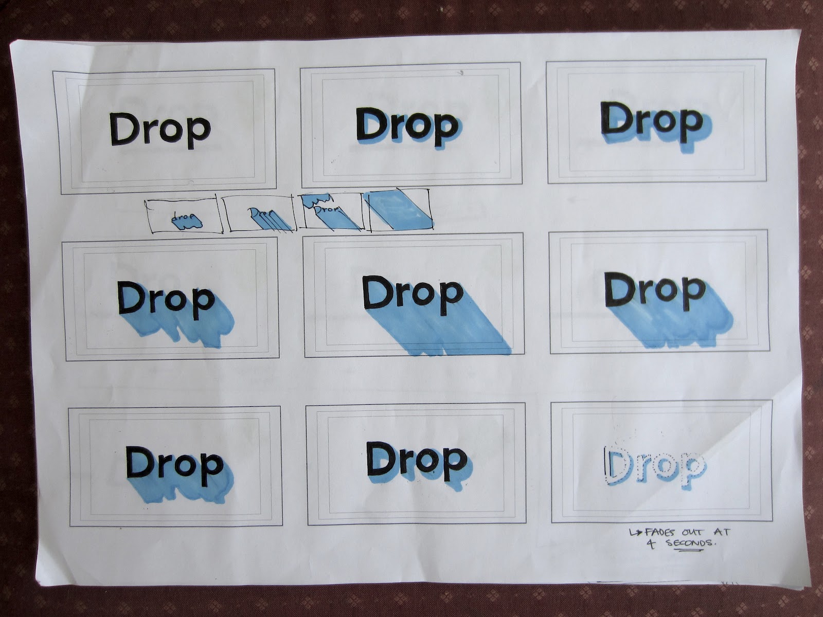
Drop Shadow
After having explored After Effects in the other brief I wanted to re-design all of my silent movies to a consistent professional set. I wanted to stick with a minimalist set where just the small movements in the clips represented the words rather than the choice of typeface / sizing etc. The yellow background works with the other backgrounds and the greys, as in the other videos, were created using different white opacity's.
Dropping Weight
Wanted to match the previous aesthetic but use some more simple demonstrations of my final words. Again decided against using black because I think it compromises the composition between the grey text and coloured background. The idea is based on the typeface losing weight, being a common phrase with the word drop in it - 'drop some weight'. Chosen typeface was helvetica neue because there are so many different weights, I was going to explore adding some oblique text but it doesn't line up the way these other weights do.
Drop Simple
Decided I wanted some that were more simple that directly communicated the content of the word. I wasn't 100% on the type limits, the line is an extended dash editing on illustrator but after experimenting with and without it, the one with delivered clearer communication of the word. Starting to get a better idea of using the easy ease features which deliver a more lifelike representation of movement.
I also really like the blue background, sits nicely with the grey text, but I do want my 5 videos to be consistent so that they work as a set. I will go back through making sure that they work together, they don't necessarily need to be the same colours or typefaces but the general composition, tone of each colour etc should remain relatively similar.
I also really like the blue background, sits nicely with the grey text, but I do want my 5 videos to be consistent so that they work as a set. I will go back through making sure that they work together, they don't necessarily need to be the same colours or typefaces but the general composition, tone of each colour etc should remain relatively similar.
4.2.12
Ident 3
The idea behind these idents is that they draw people in, instead of giving away all the content of the programme they use the architecturally inspired imagery getting people to watch it. With the ease of online TV guides and programming on 4od the information is readily available and this seems like a more subtle way of gaining interest. Also because of the nature of the imagery it will indirectly address my target audience.
Final Ident 2
The final second finished ident with the audio and opacity settings fading accordingly towards the end. Summarised most of my personal evaluation of this ident in my last post but I want to get feedback from others to make sure my design process stays in the right direction.
Ident 2
Finished ident 2, tried using the previous entrance through a mask for the more 4 logo at the end but the half screen seemed far more aesthetically suited. It follows the channels current branding in relation to type size / spacing / layout but with a slightly different entrance method, but these are ever changing so didn't see it as an issue.
Another alternative audio choice, electronic based synths but I didn't change the audio levels to fade out at the end on the second video. I will retune the audio and re-upload onto vimeo / my blog. Also think the bridge vector ends up to prominent against the fading text so I will change the opacity levels towards to end so they both fade simultaneously.
Another alternative audio choice, electronic based synths but I didn't change the audio levels to fade out at the end on the second video. I will retune the audio and re-upload onto vimeo / my blog. Also think the bridge vector ends up to prominent against the fading text so I will change the opacity levels towards to end so they both fade simultaneously.
Ident 1 Rework
The relationship between audio and movement is consistent and harmonious the communication of the content of the programme isn't necessarily clear enough. The images of the bridges have come together really well with the masks and the contrast between the circle and rectangle moving created some interesting visuals. The clean black and white imagery on grey works as an overall composition and fits with the channels sleek re-branding.
Ident 1 Practice
The idea behind my idents was to rework segments of the title sequence, they were going to consist of 5 or so different elements that congregate through the title sequence de-constructed and redelivered into 10 second clips. I have re-worked the 4 ident as well making the logo fall into position slightly before the previous clip making it a less substantial 3 seconds rather than 4. It has also been slowed down and the opacity turned down slightly. Conceptually this ident works but visually it should include one more element to react more with the chosen audio. I want to change the audio for the different idents because the visuals are so recognisable the same music would become repetitive and boring.
The other main issue was that the sound decibels drop to early, want them to still have prominence when it comes to the 4 logo panning in through the pre-composed mask.
The other main issue was that the sound decibels drop to early, want them to still have prominence when it comes to the 4 logo panning in through the pre-composed mask.
Title Sequence Rough
Status update with the video, I wanted to upload it because it gives me some security in case anything happens to my files, or there are any other technical issues, but also to show how it looks without the extra work.
My plan was to put the video together with the music using the direction from my storyboards and practice videos. This isn't exactly how I want the final video as there are parts where the sound doesn't fit with the movement, also the audio on the ending isn't ideal. I will now spend the next few days fine tuning the movements and applying different effects to make the movements flowing and lifelike.
I don't think it is appropriate to put the More 4 logo on the title sequence because there is no need for it as the programme is already on. I have however decided that it will work perfectly with the idents going for the same abstract approach but with the text at the end the same way current More 4 idents play through. The only time the More 4 logo comes up on current programming is at the end of shows.
The one major change that I think should be made is either taking the titles away from the beginning and putting them at the end to avoid people turning it on and not knowing what its about. This is the way most current TV title sequences are done, but it might be applicable to put titles at the beginning and end of the sequence because of its abstract nature.
My plan was to put the video together with the music using the direction from my storyboards and practice videos. This isn't exactly how I want the final video as there are parts where the sound doesn't fit with the movement, also the audio on the ending isn't ideal. I will now spend the next few days fine tuning the movements and applying different effects to make the movements flowing and lifelike.
I don't think it is appropriate to put the More 4 logo on the title sequence because there is no need for it as the programme is already on. I have however decided that it will work perfectly with the idents going for the same abstract approach but with the text at the end the same way current More 4 idents play through. The only time the More 4 logo comes up on current programming is at the end of shows.
The one major change that I think should be made is either taking the titles away from the beginning and putting them at the end to avoid people turning it on and not knowing what its about. This is the way most current TV title sequences are done, but it might be applicable to put titles at the beginning and end of the sequence because of its abstract nature.
Ident 1 Re-visited
Decided the overwhelming scale of the imagery on the screen
compromised the clarity of consistency through each of the idents. Kept
the idea based on the circles in the other ident using a different sound
track. Also changed the audio keeping it more consistent with
the other idents - again electronic based / glitchy music representing
the abstract visual approach.
Sliding Bridges
I wanted to emphasise the point of 'the architecture of connection' and was using these images to connote this. These are all really simple ideas again based on similar concepts on my storyboards and possible options for my idents. Not sure if I will include them in my title sequence because it might over complicate the finished outcome. I may start experimenting with masks for a possible way of including this approach in my title sequence.
Colour Experiment
Ended up going for a black and white images because the colour compromised the clarity of the other imagery in the video. I wanted to start adding some colour, especially because of the re-brand looking at vibrant backdrops and the images distorting revealing them. The green works and contrasts well against the grey tones, another clean visual reference to architectural techniques.
I have storyboarded out some of these ideas but I find it much easier experimenting with little clips on After Effects then storyboarding using the different techniques. None of the videos have had the easy ease applied as they were just tests to see how motion could be applied through the still images. I will now go back to storyboarding and develop these ideas towards my title sequence and idents.
I have storyboarded out some of these ideas but I find it much easier experimenting with little clips on After Effects then storyboarding using the different techniques. None of the videos have had the easy ease applied as they were just tests to see how motion could be applied through the still images. I will now go back to storyboarding and develop these ideas towards my title sequence and idents.
3.2.12
More 4 Attempt
Wanted some way of including the new logo ident so I made my own version following a similar structure to the current more 4 idents after adverts. The concept was based on the channels updated content with the logo coming into the light connoting different issues being exposed. The clip is 4 seconds long so don't want to use this exact version but if I apply the easy ease functions to give a smoother effect and simplify the movement to clip down the composition.
2.2.12
Silent Movies Storyboards
Wasn't happy with my previous silent movies and wanted to make bring them together as a set, these are the storyboards, I have decided to keep them a bit less extravagant to represent the denotations of each word.Will remake the silent movies but make sure they are still communicating the desired message. I'm not exactly sure what colour schemes I will use but I will have a look through the RBG gamut to make sure they are all consistent tones giving me a balanced but consistent set of final silent movies.




Subscribe to:
Posts (Atom)