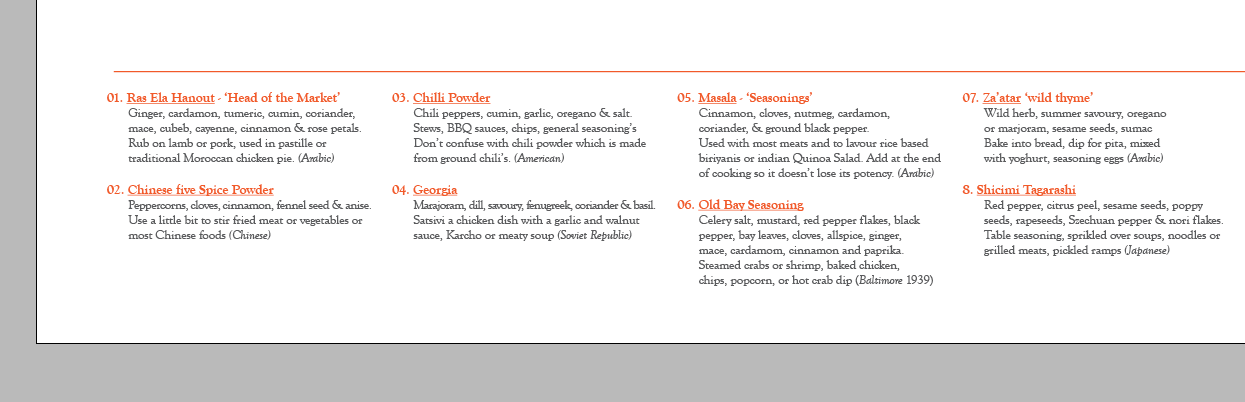
I have been doing some experiments with the layout of text on the poster, highlighting different bits of information using solid blocks of colour on low tints. The poster is A1 and will fold down into a A4 hot dog fold format with different recipes using the spices and spice mixes. It also explains the empty boxes where people are encouraged to make their own spice mixes and save them on the app / website.
Keeping the number of grids to a minimum has proved an effective tool of organising text, the grid is split into 10 columns allowing two paragraphs / headers of text into each allowing the 20 pre mixed spices to be divided equally.
-
As the image below shows the use of block colours adds another hierarchal element to the layout of the page and information.
Using one simple line above the text and segregating the text from the image. This is the cleanest but I feel could be developed to be far more interesting, I will consider how the blocks of colour could work for this one.
The blocks of solid colour added confusion between the numbers / headers and their relationship with the small bits of body text about the included spices and their possible uses.


No comments:
Post a Comment