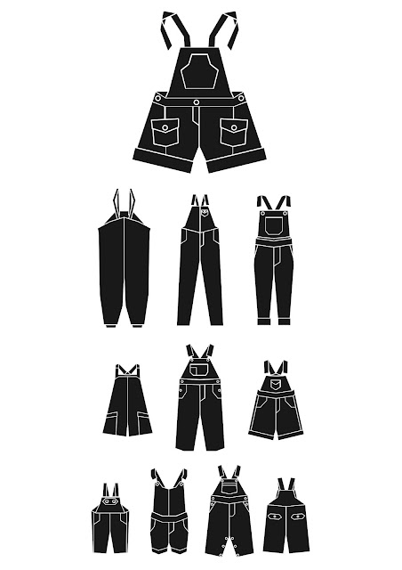
When testing the eye charts the group were able to define each of the images even the smaller imagery. The main areas for improvement were to experiment with colours, but I don't want to compromise the context of communication of the imagery. Also need to consider the most suitable stock and print methods, again will be catching up on this during reading week, going to stay in Leeds for the week rather than going home. One idea for a stock / print method was to put it onto A2 plastic / acetate and put a light behind it to really put it into context.Images below show the final poster design and how it looks in context.
Again some issues when resizing the vectors but I will take it to the technicians and see how this problem can be resolved. I did try expanding and transforming them to make them flat vectors but the stroke weight kept varying where lines overlapped.


No comments:
Post a Comment