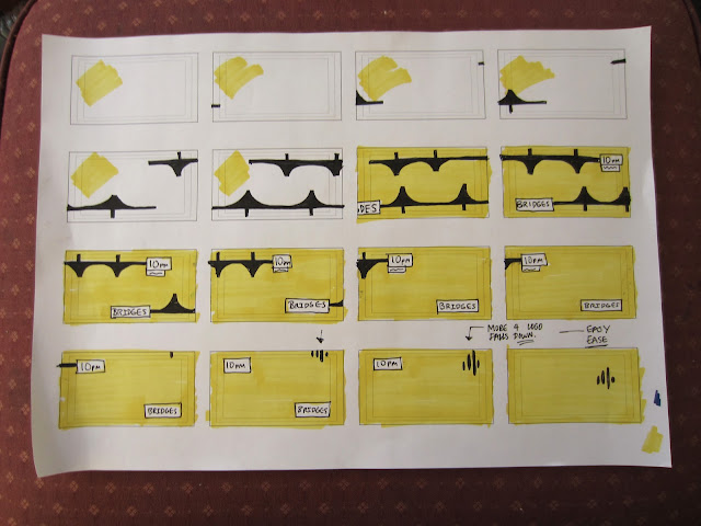
The first few storyboards were tedious and over complicated which ended up taking up more time that I expected. I have realised that I can simplify the movements and imagery but still communicate the desired ident idea.

>>>>>>>>>>>>>>>>>>>>>>>>>>>>>>>>>>>>>>>>>>>>>>>>>>>>>>>>>>>>>>>>>>>>>>
These are some storyboards working with the More 4 branding, saw a new More 4 ident on TV the other day so I will look into that
and see if I can get any more information on the re-brand. This may give
my visual approach something more direction and gain me a greater
insight to my target audience. These designs are a long way from what I saw on TV so the re-branding research is an urgent issue. The vibrant colour schemes contrast well with the vectored bridge designs, the technique I would need to use to achieve these videos is 'right on', I have discussed it with a few class mates but want to develop my ideas through my storyboarding before I commit to After Effects.
The grey design at the bottom has the strongest visual reference to architecture, the combination with structural elements the grey tones seemed particularly suitable. I do however want to consider adding some brighter tones to contrast the clean visuals.


No comments:
Post a Comment