19.11.11
Label Experiments
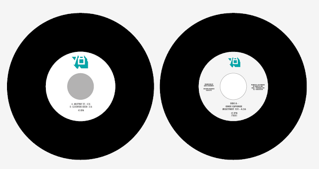
Label designs for the 7inch records, experimenting with different typefaces, kerning, leading and case to get the most legible but visually suitable results. The photos work but compromise the ledgibility so for the moment I will avoid using them. Playing around with a few different colour schemes and gradients, the designs with blocks of colour are much more effective and work with the sleeve designs. Designs done using the same two spot colours as the sleeve to maintain the same identity and images converted to monotone using the selected pantones. Any other colours in the designs are using CMYK swatches. The last 2 designs are the ones I am going to stick with, think the design could look really interesting while it spins, also clearly communicates all of the information on the Vinyl.


Subscribe to:
Post Comments (Atom)


No comments:
Post a Comment